RYAN NUSSBAUM/
UX & BRAND DESIGN
Saatva Mattress Redesign
Saatva is America’s best-reviewed luxury sleep brand. In 2010 they disrupted the industry by becoming the first brand to sell a mattress exclusively online. By 2017 they had reached over 180 million in sales. With rapid growth focused on new product launches, Saatva’s core site experience had fallen behind. I led the UX team to transform the site into a more interactive, conversion-centric experience. The team went through several iterations, usability tests and a/b tests to reach a new site paradigm.
Role: Director of UX
Issues with the shopping funnel
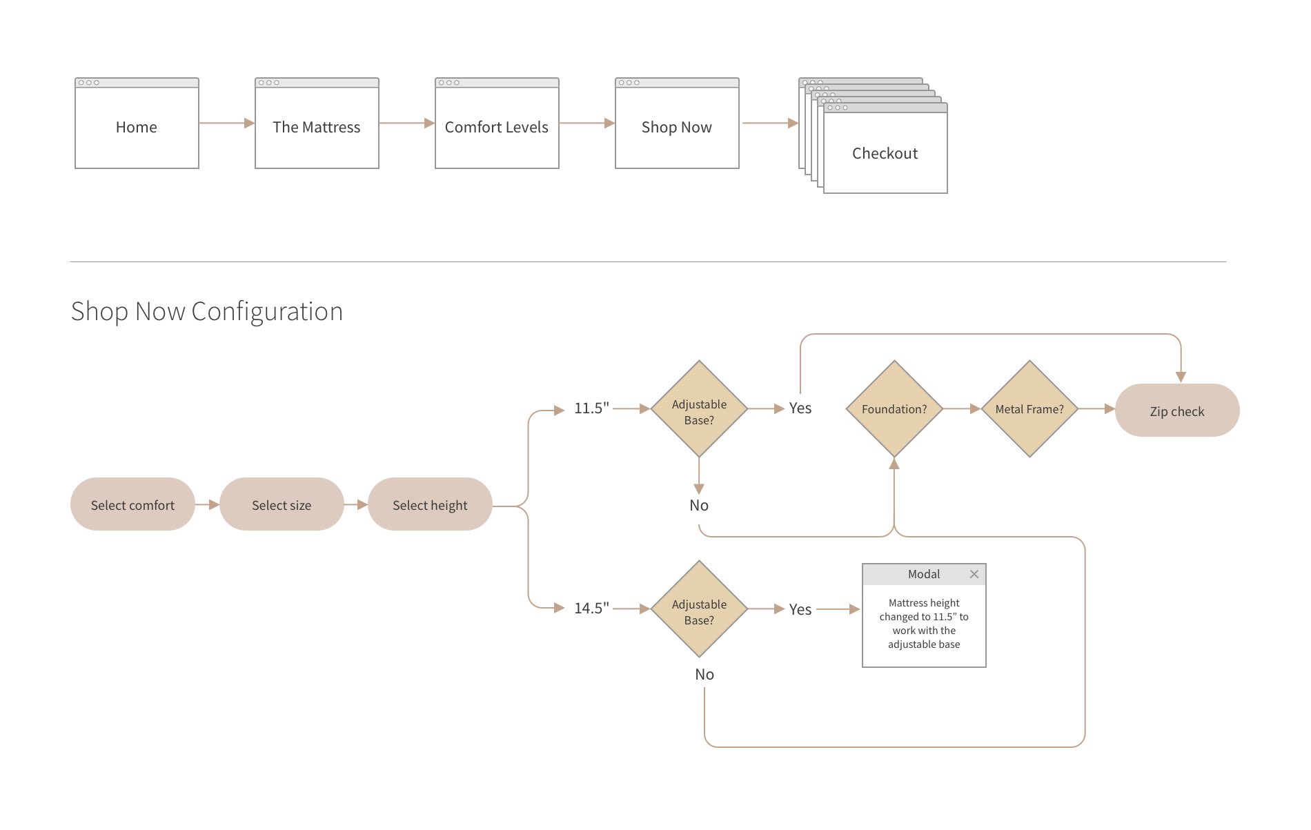
A funnel analysis of the site’s main journey in Google analytics revealed that a large percentage of drop off was happening before users reach the shop page where mattress customization occurs. Our primary challenge was to capture more of this upper-funnel traffic. Mattress configuration on the shop page was also complex. Users were suffering from choice overload and analysis paralysis with 25 clickable elements on the page.
User Flow Take 1
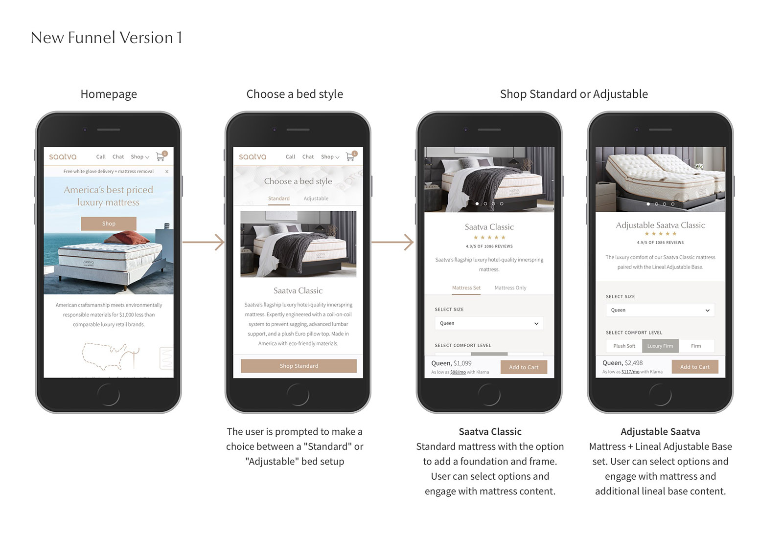
From our interviews with past customers, we determined that the needs of the adjustable base customer were different from those getting a mattress with a foundation. We decided to prototype a new shopping funnel where this difference was the primary choice one step into the journey. Users are prompted to choose a bed style, either “Standard” or “Adjustable,” which directs to two separate shop pages that have configuration and content. Our hypothesis was that users would spend the majority of their time on these shopping pages.
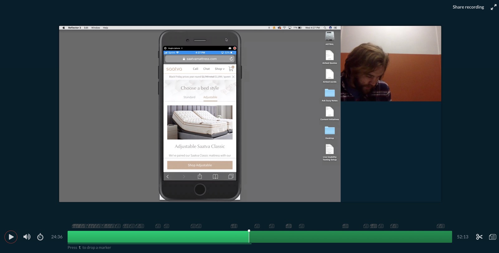
User Testing the Prototype In order to test our hypothesis, we recruited 11 people for an in-person moderated test. Users were all currently shopping for a mattress online at our price point or above. Several themes emerged in the results: Most users were decisive in their bed style choice and thought it was easy to make selections and add to cart. They also responded positively to the overall design and imagery. However, most desktop users did not scroll on either of the shop pages, so they were missing out on key content that would have informed their purchase. Most users were also confused by the term bed style, and were wanting more information about comfort, materials, and delivery before making their selections.

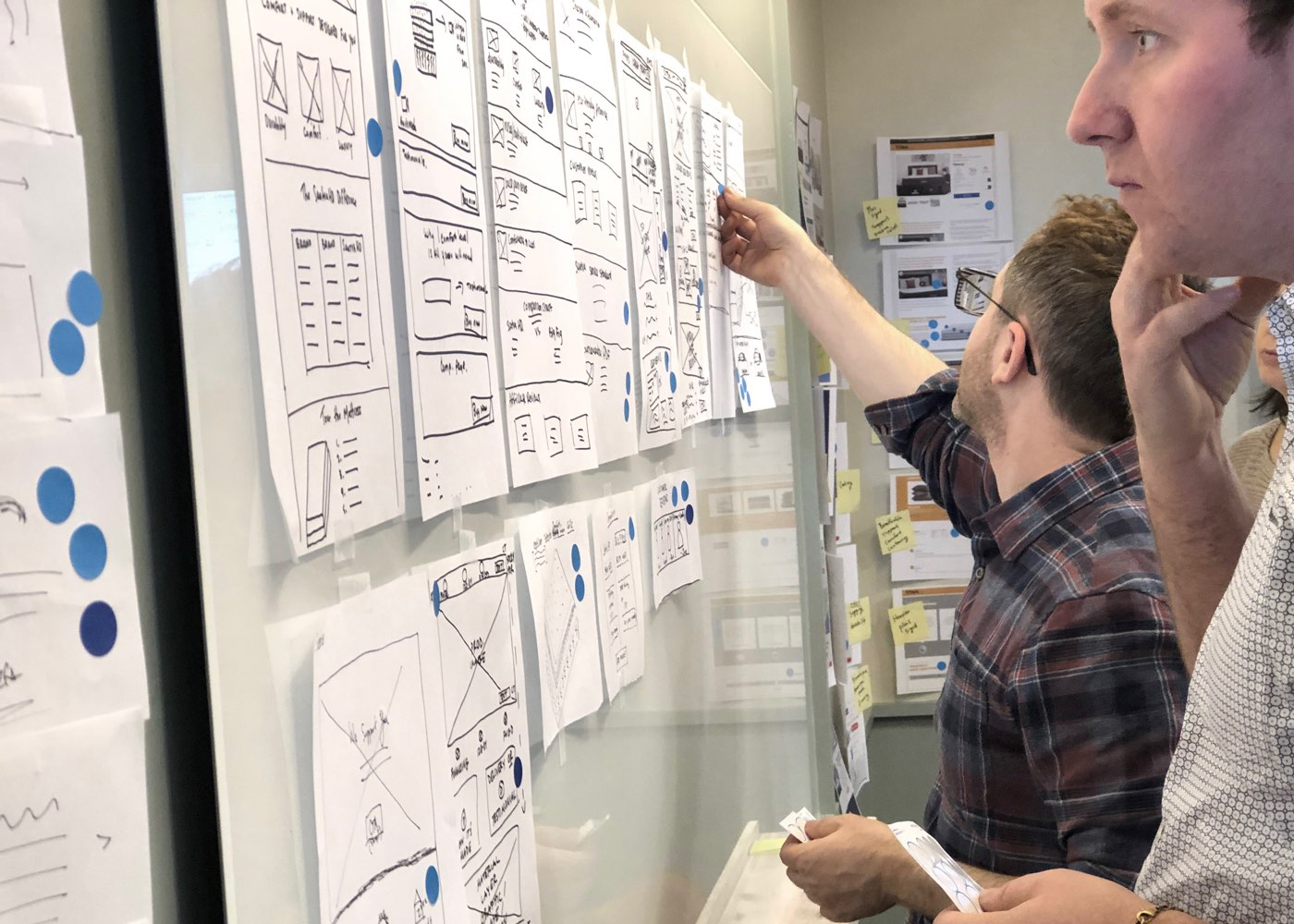
Collaborative whiteboarding and sketching Armed with our user test results, I facilitated a sketching and dot-voting session with stakeholders to come up with the best solutions to try in the next round. That’s me up at the board, in case you were wondering.

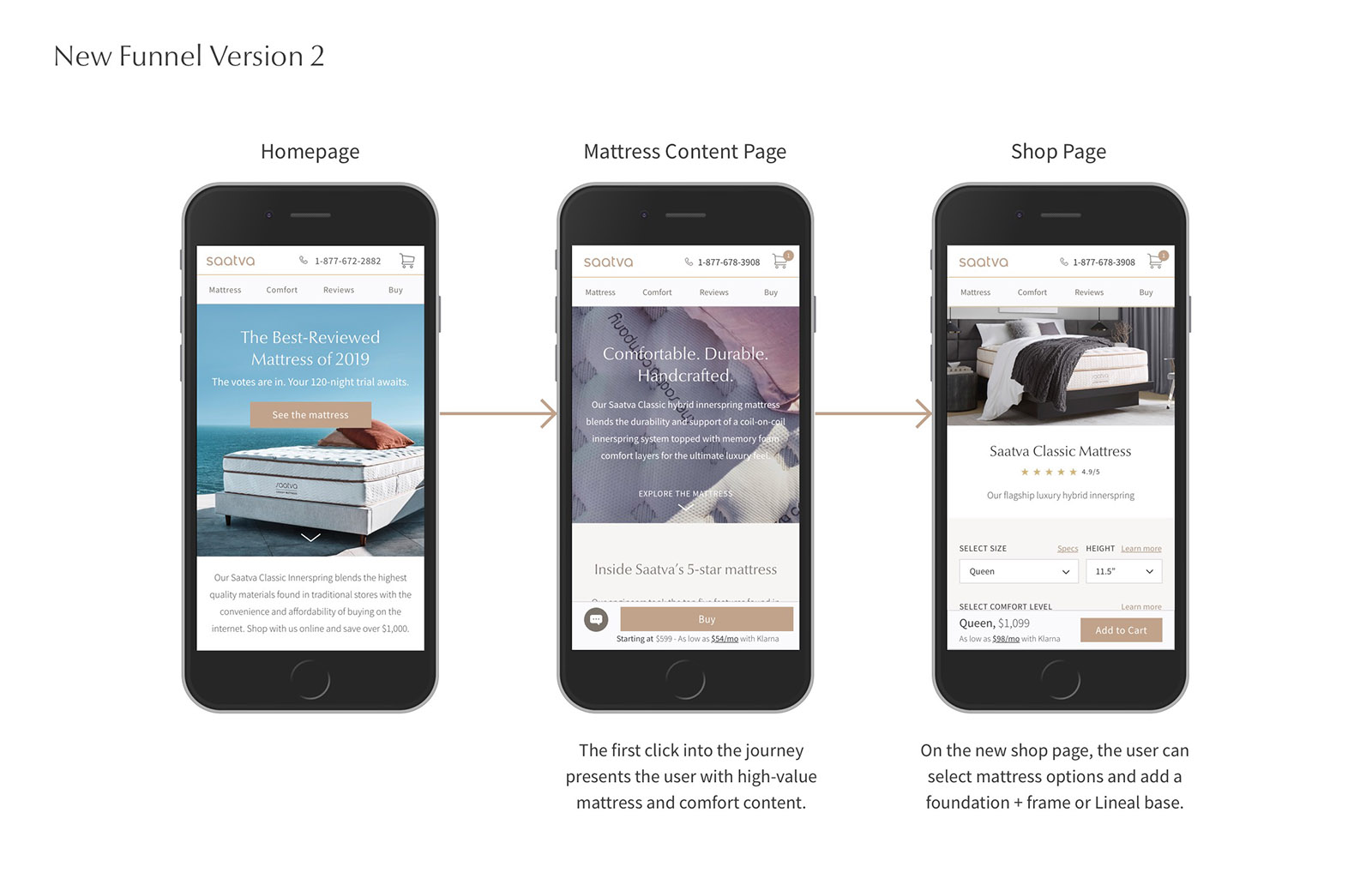
User Flow Take 2 After our sketching session we decided to go back to the single shop page, but combined the two previous content pages, mattress + comfort, into one. This move would solve some of the content discoverablity issues that occurred in the test by making extensive mattress and comfort information available one click into the journey. We also overhauled the shop page for a more streamlined configuration experience
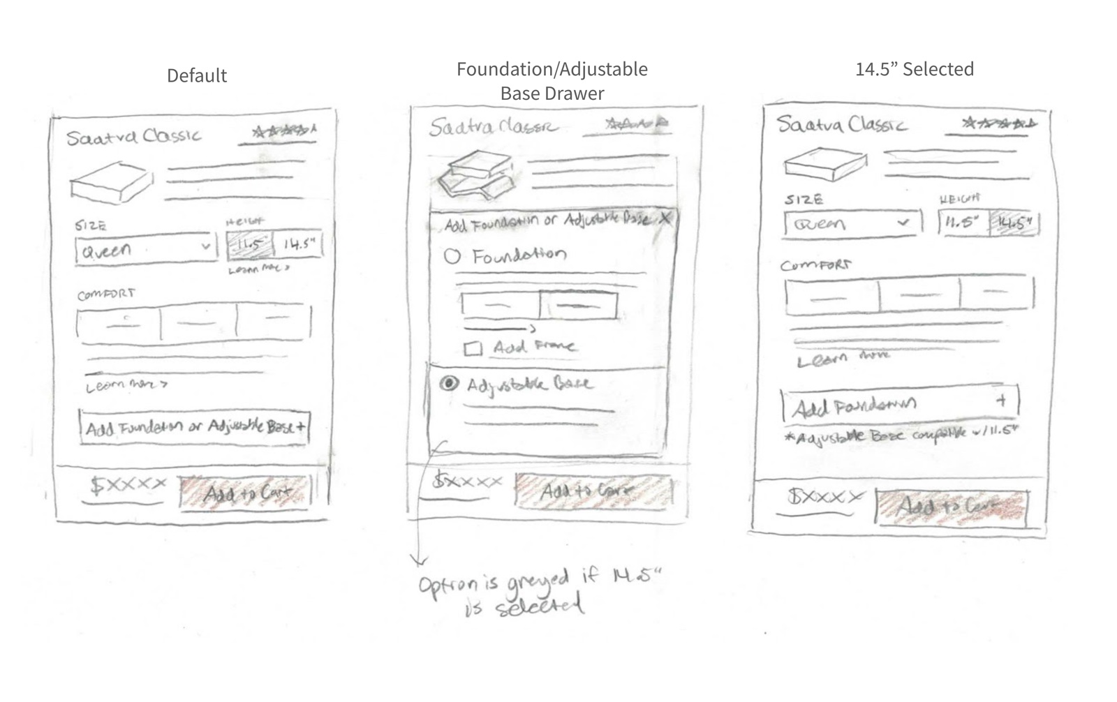
Product Panel Iteration Since the mattress product panel design pattern would be repeated across other products, we needed to take the time to get it right. Now that we were back to one shop page, we still wanted to find a way to cater to the needs of both standard and adjustable users. We wanted to understand if adjustability is a top-level decision or an addition that occurs after customizing the mattress. We created two different product panel prototypes for a comparative user test in order to get answers quickly. Sketches for Option 1 User selects the mattress, comfort level and then decides to add a foundation or adjustable base.
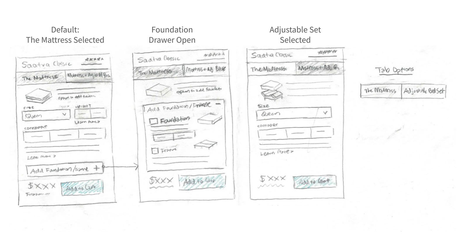
Sketches for Option 2 The user selects a tab, mattress or mattress + adjustable base. This allows for more foundation and adjustable base content to be exposed in the drawer.
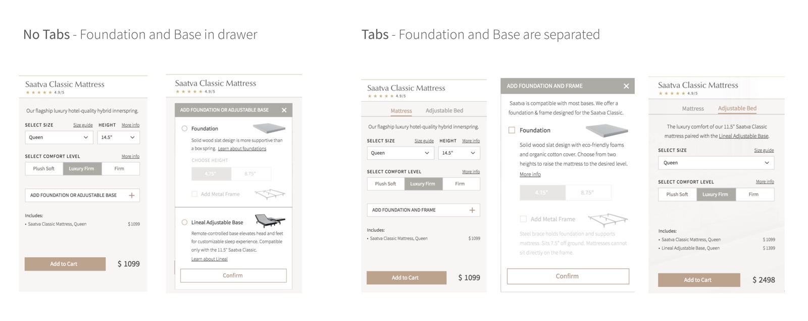
Results Results for this comparative test were mixed; there was no definitive winner between tabs vs. no tabs. However there were other insights that helped inform our solution. Few users clicked on the product panel modals, where key foundation and adjustable base content is located. We knew we needed to bring the most important content out of modals, as well as make the links appear more interactive.
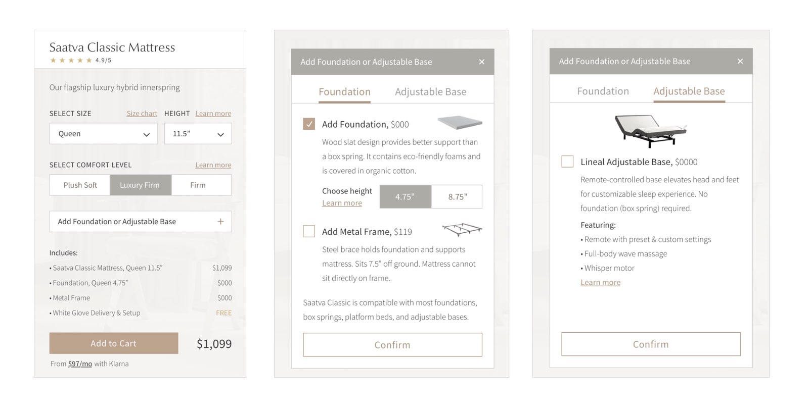
Product Panel Recommendation After discussing with the product managers, we came to a consensus that both the foundation and adjustable base are secondary add-ons, and that having tabs at the top level was distracting. However, we did acknowledge that the tabs allowed for a clear binary choice and provided extra room for important information. We decided to merge the best of both designs and combined the foundation and adjustable base into a single tabbed drawer.
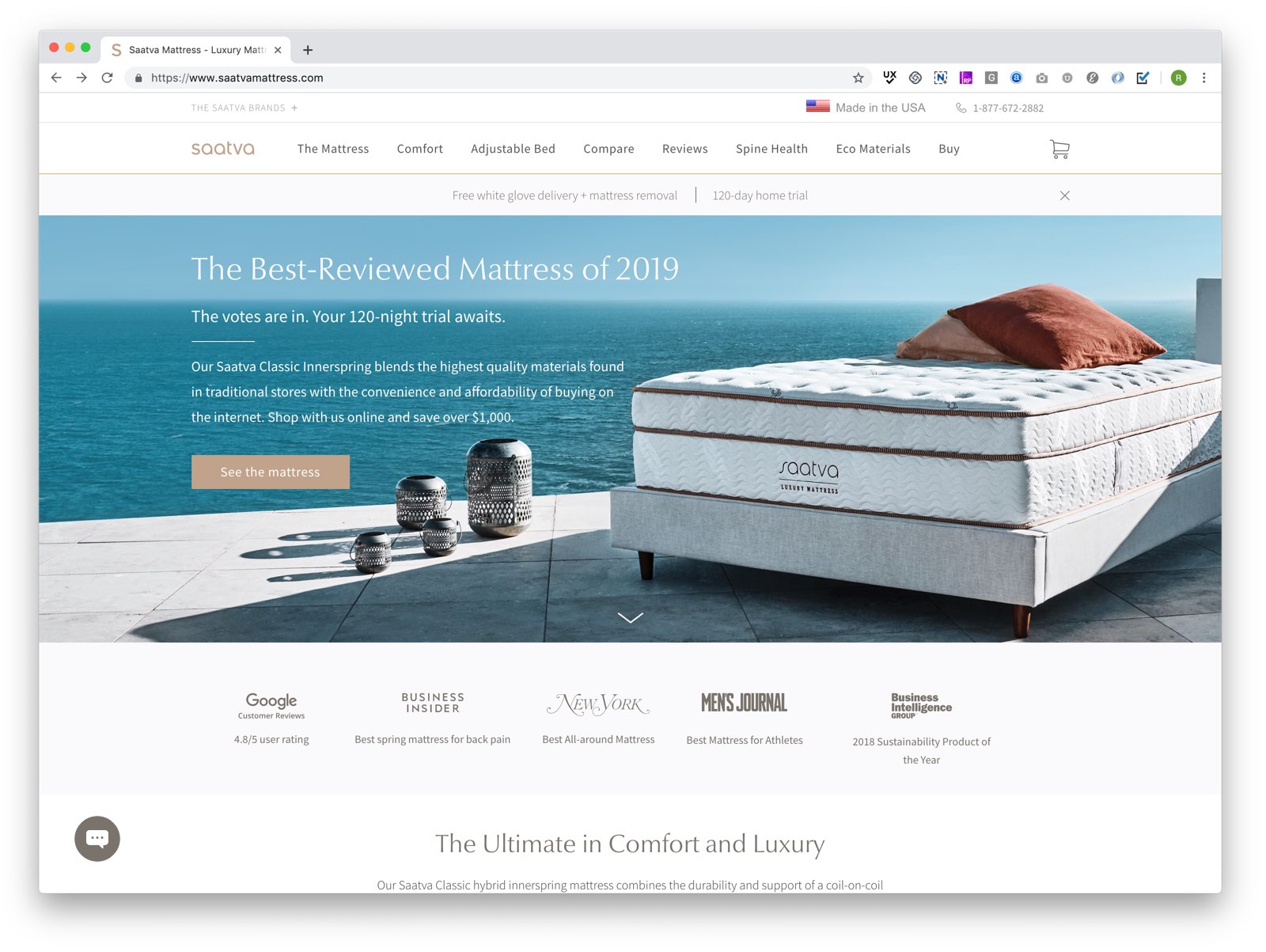
New Homepage: Final Design The new homepage features a quantifiable, straightforward headline that is validated below. We shortened the hero image from previous iterations to encourage scrolling.
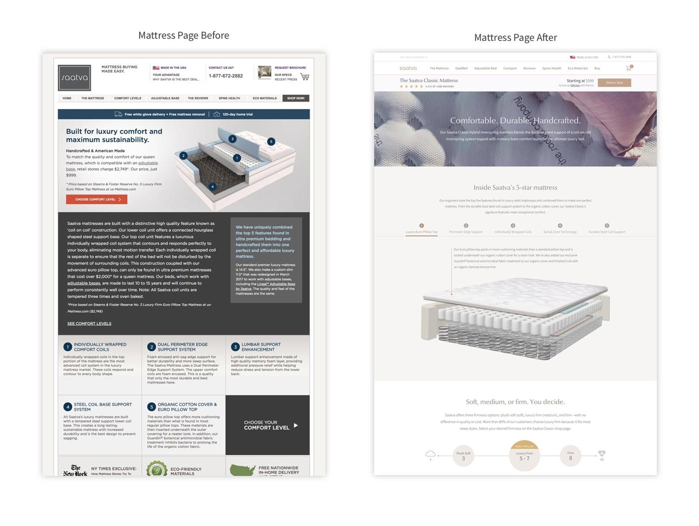
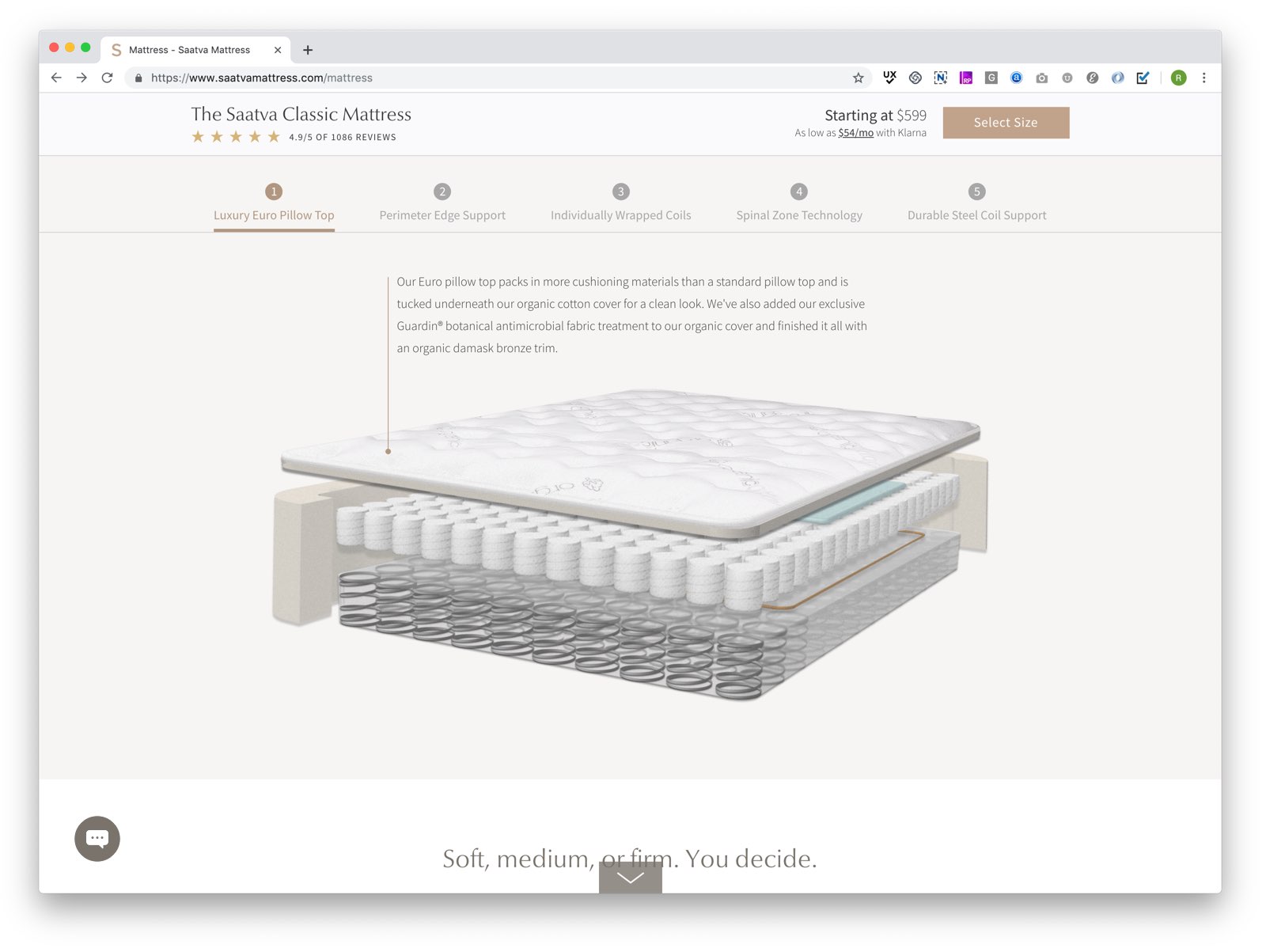
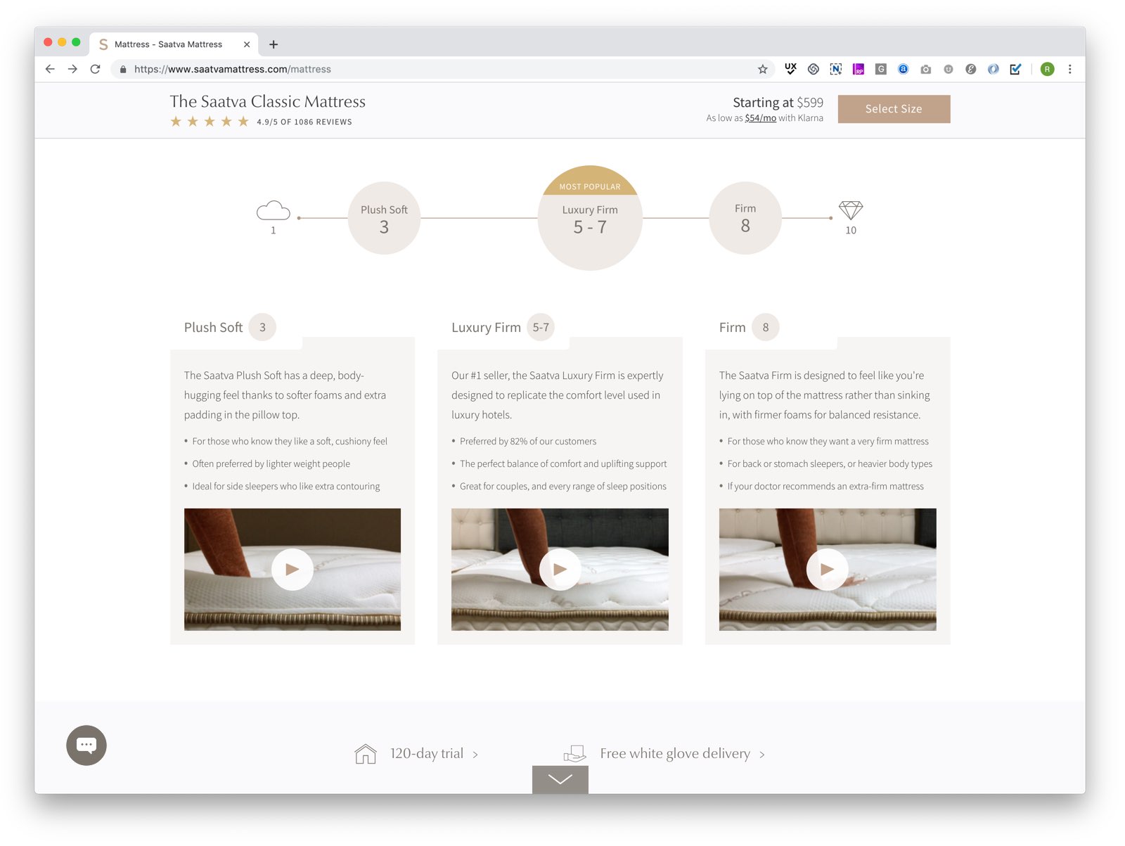
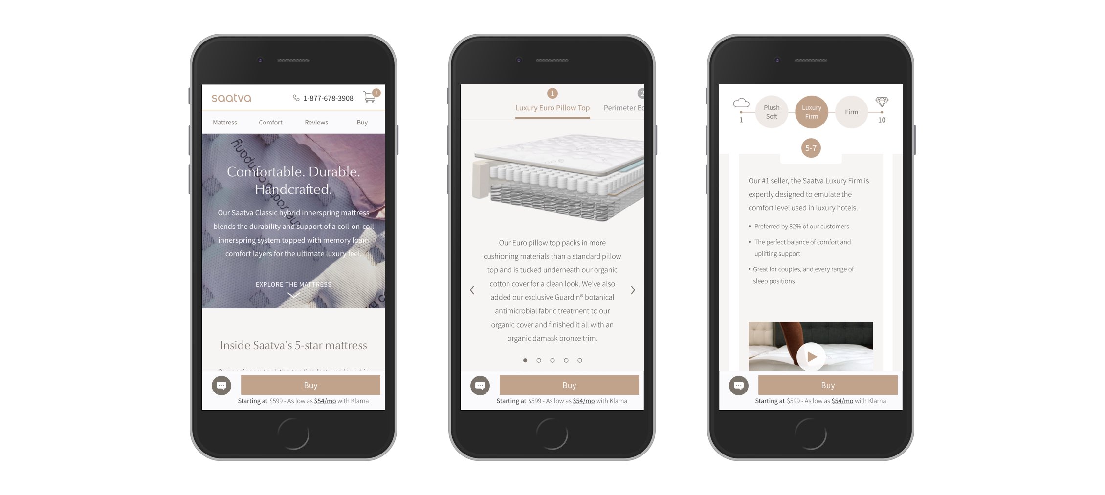
Final Design: Mattress Page The new mattress page represents an overhaul of the previous mattress + comfort levels pages and provides crucial construction, materials and comfort content. Users are able to explore each of the five layers of the mattress in a new interactive mattress diagram, and can see what each firmness feels like with enhanced video content. Reviews and supplemental articles are weaved throughout for additional validation and education.
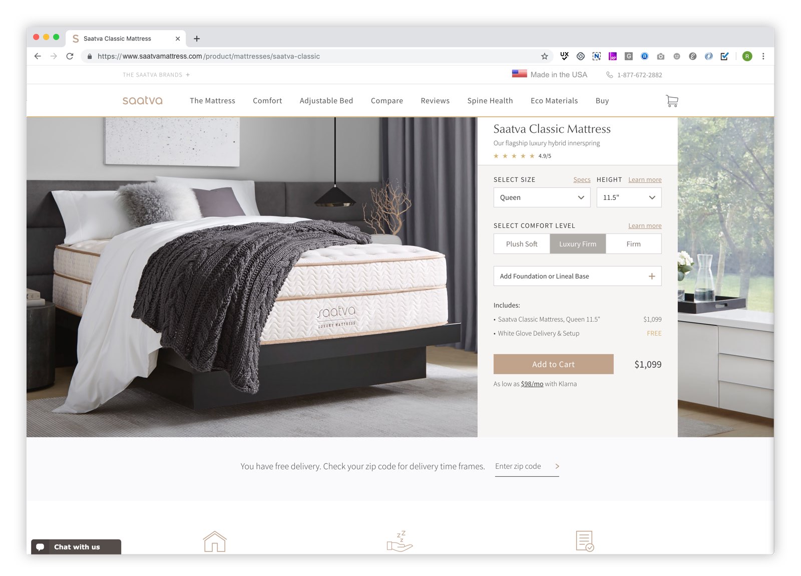
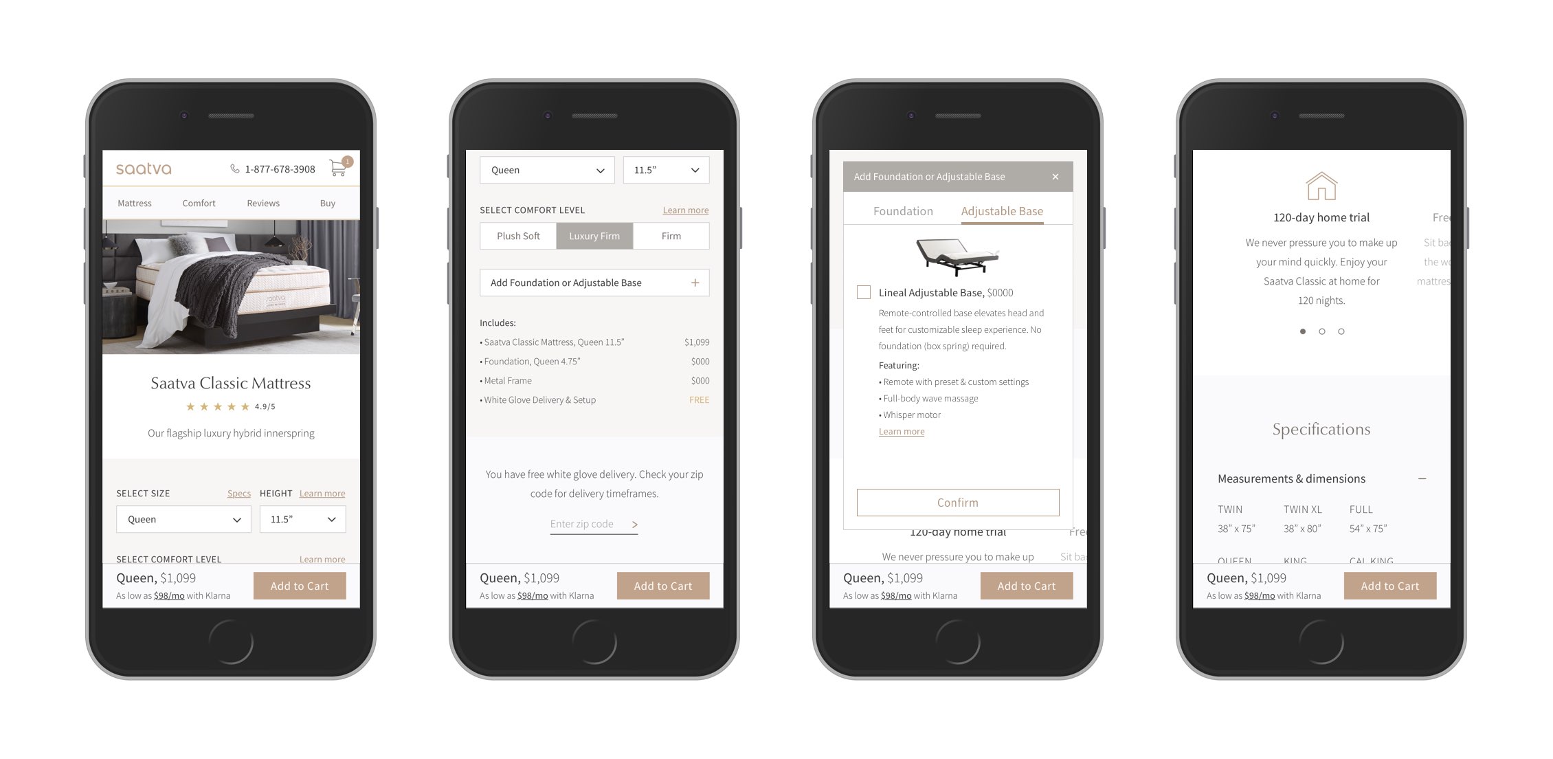
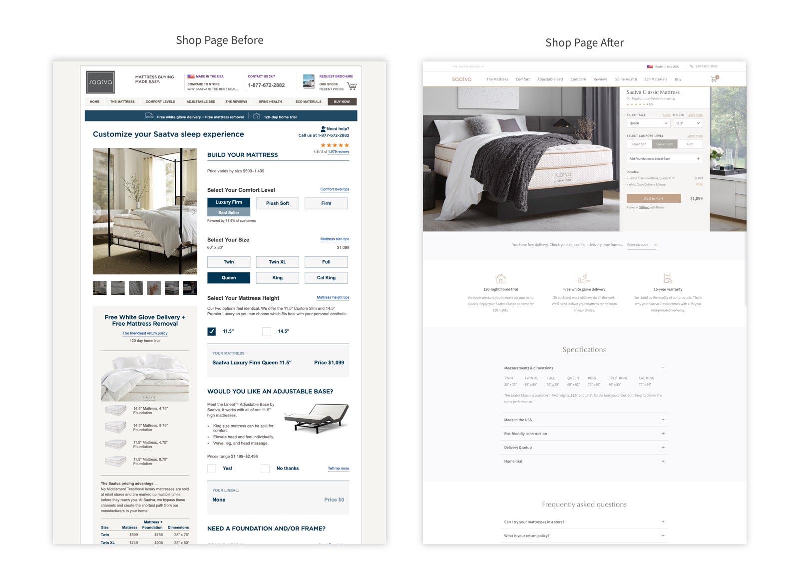
Final Design: Shop Page For the new shop page, we streamlined the mattress customization proces and used new react components that we would could leverage across other products.The page also includes lower funnel service story content, such as descriptions of Saatva’s free white glove delivery and 120-day home trail for added validation.
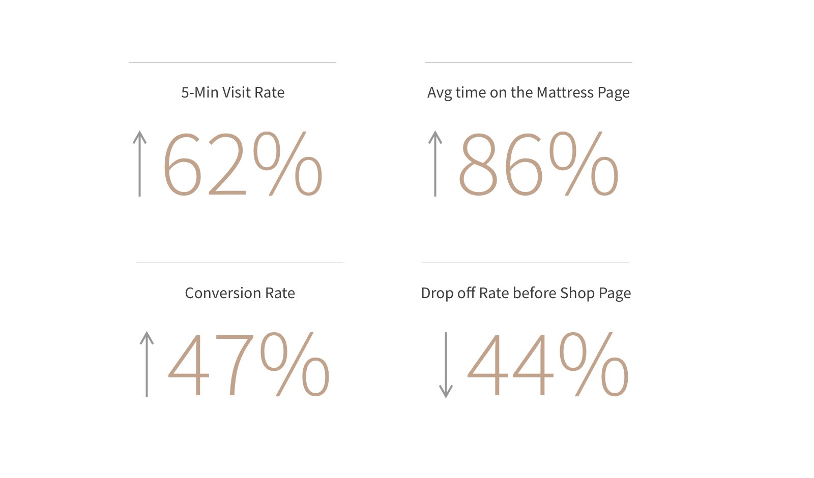
A Winning Experience The redesign outperformed the previous experience across a number of metrics. Overall, visitors were more engaged and converting at a higher rate.
 VIEW ALL UX & PRODUCT