RYAN NUSSBAUM/
UX & BRAND DESIGN
Avivi Skincare
Avivi is a luxury skincare line comprised of body oils, scrubs and facial serums that blend avocado oil with essential oils. As their initial launch would be online only, they needed an e-commerce site and microsite to kickstart sales. With a unique packaging concept already in place, I led the creation of their digital presence.
Role: Lead UX/UI Designer
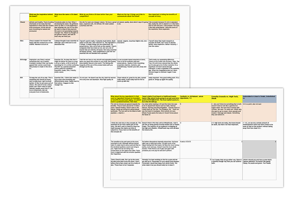
Stakeholder Interviews
Having approached us while products were still in formulation, we had the opportunity to use design to inform product development, which would affect everything from brand positioning to the user experience on the brand-site and micro-site. Through stakeholder interviews and competitive research, we uncovered that no other brand had a robust offering leveraging the hydrating properties of cold-pressed avocado oil. We recommended that all products have avocado oil in them, and this inspired the name “Avivi.” In establishing baseline criteria for the websites, we determined that both sites needed to balance romance, product education and ingredients while being conversion-centric.
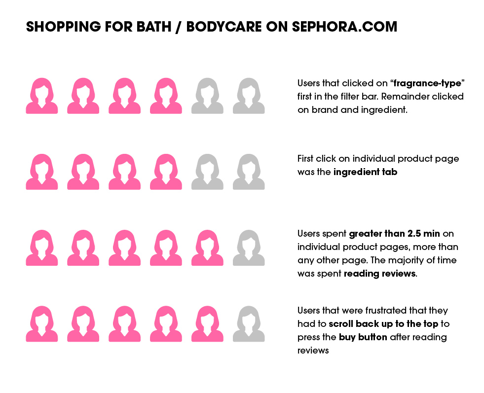
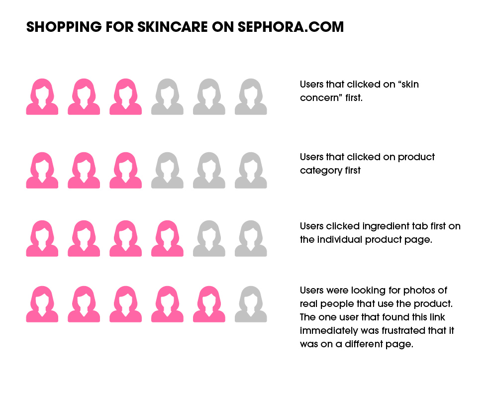
User Interviews: Empathizing with the luxury natural beauty user
We had developed initial target customer profiles during the brand strategy phase, but these lacked the online behavioral data to design an effective digital experience. As the packaging design process was underway, we recruited six users that matched these profiles and completed in-person moderated tests to determine how these users find and purchase product online, as well as what attributes they value most. Since our product line straddled both the bath/bodycare and skincare categories, we had each user shop for a bodycare product and a skincare product on Sephora.com. Some highlights from these tests are shown below.
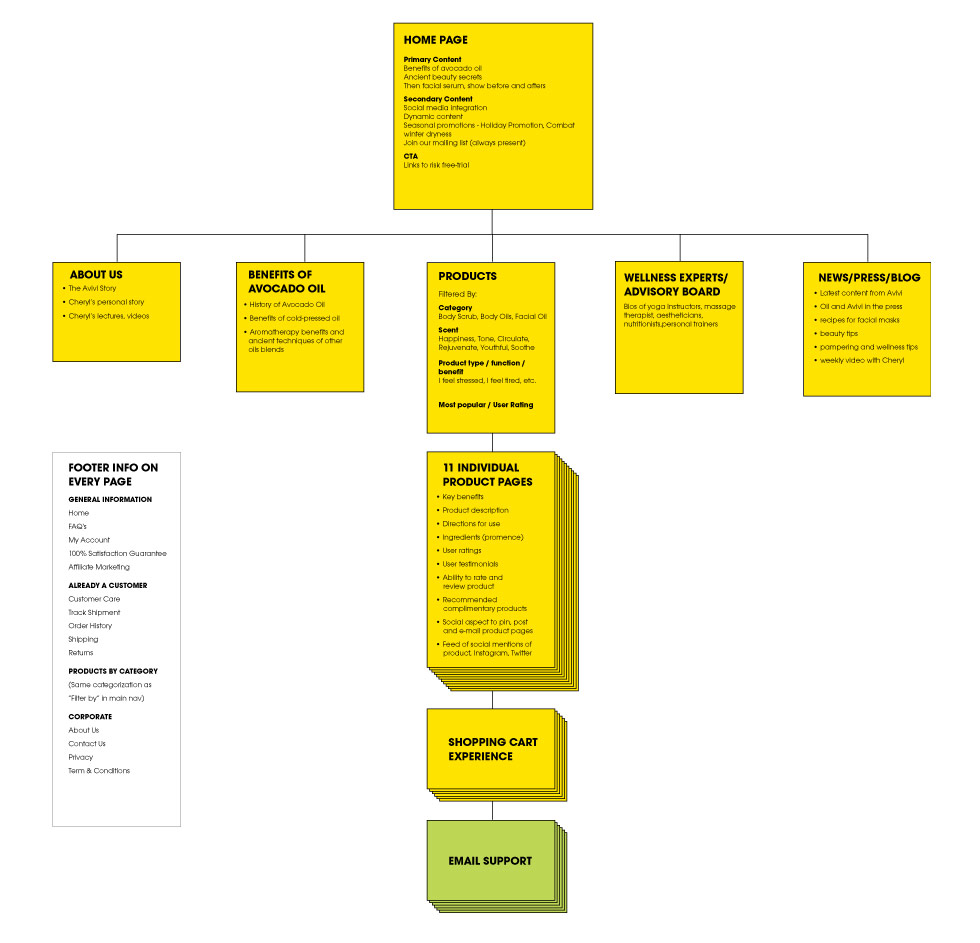
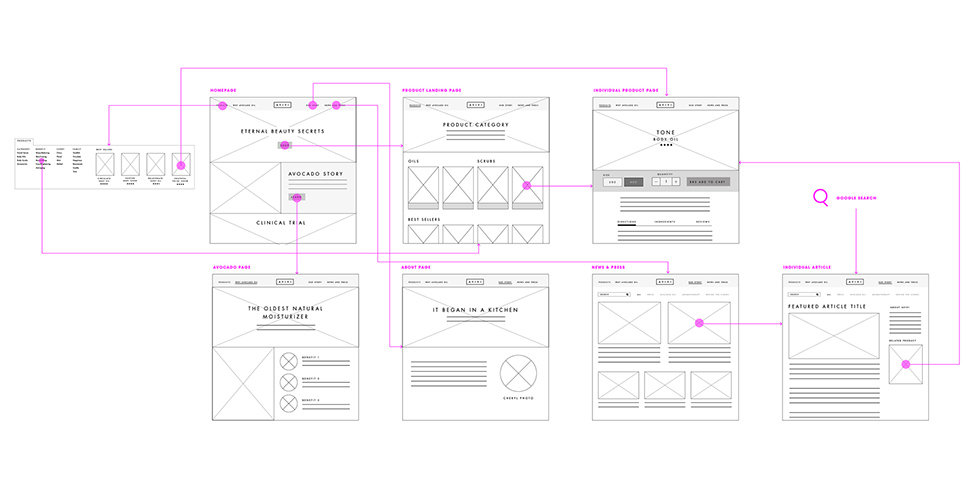
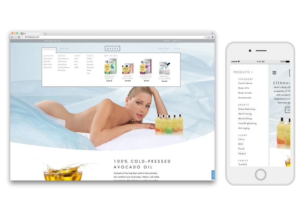
Sitemap, Sketching, & Wireframing for the Brand Site
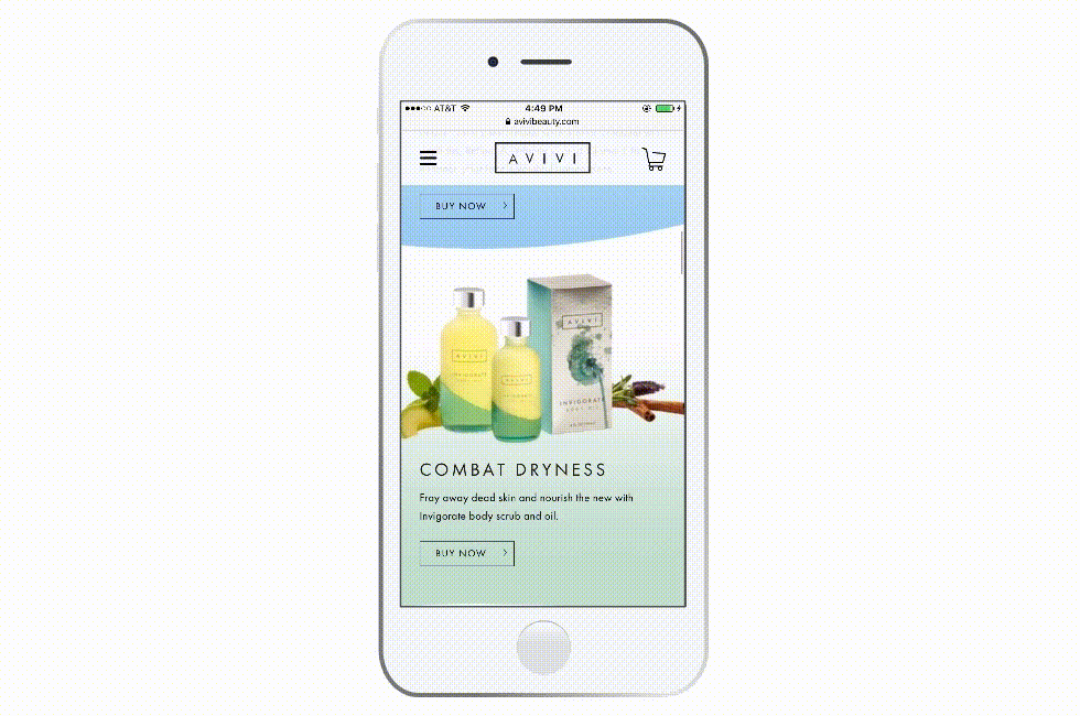
Together with the Avivi stakeholders, we developed a detailed sitemap outlining the overall structure for the brand site and priority of content and features to appear on each page. We then completed wireframes and flows to clearly indicate how pages related to each other in the overall experience. The most iconic part of the Avivi packaging, the plastisol dip that delineates one product from the next, made it very early into the website’s UI.
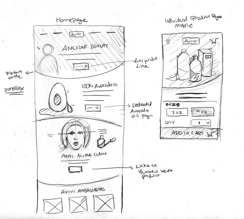
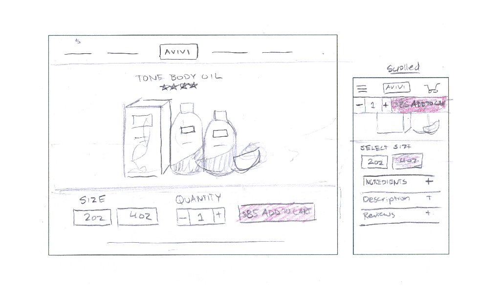
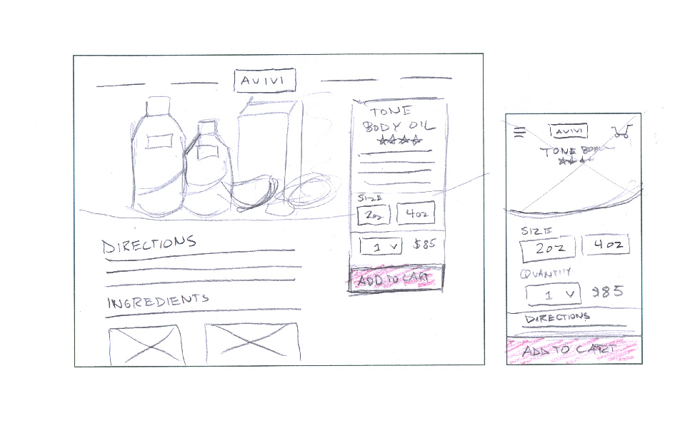
Iterative Sketching and Prototyping
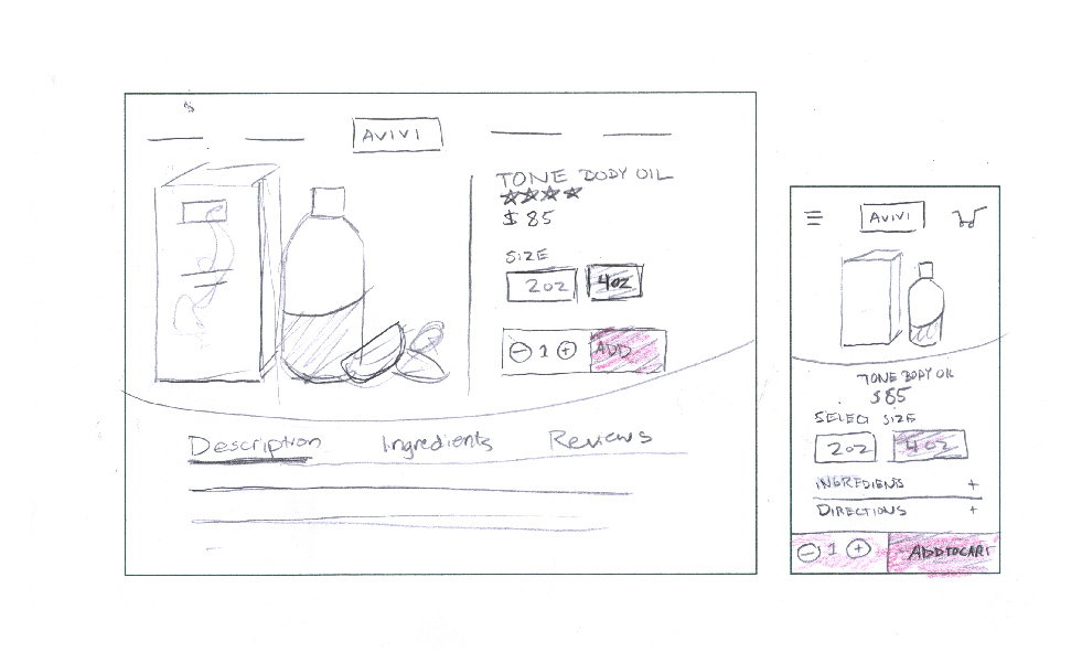
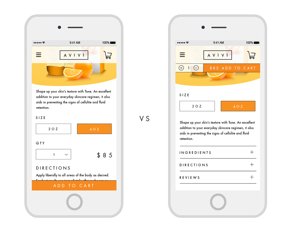
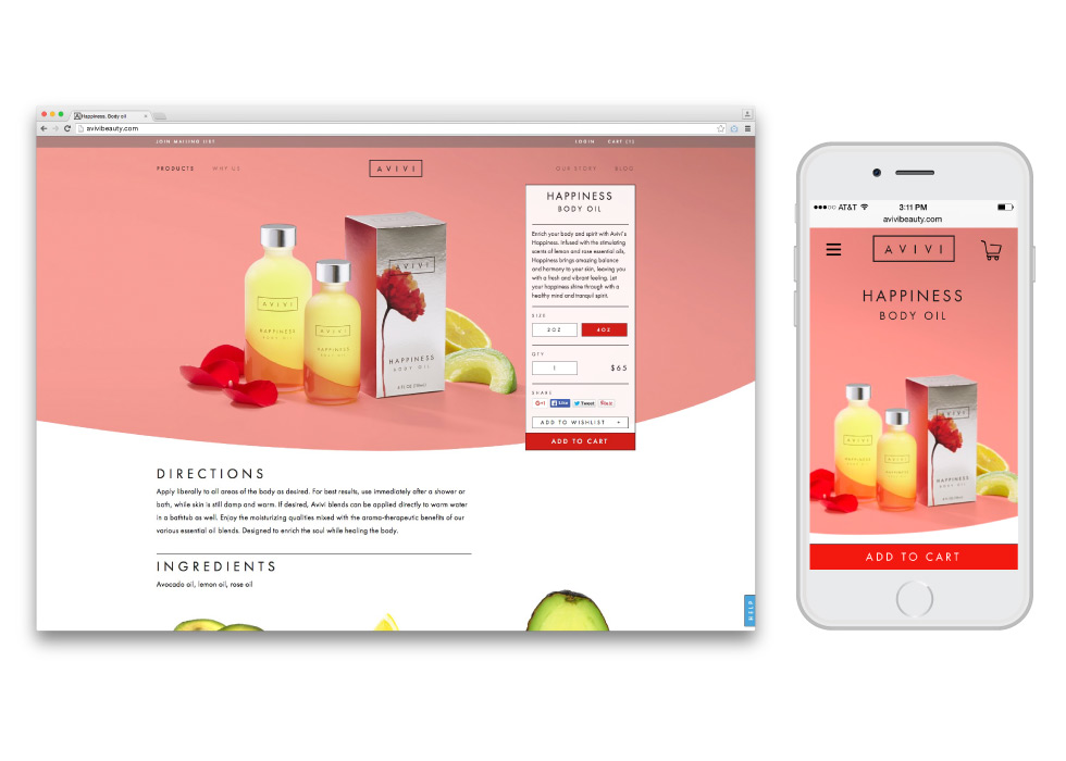
Since initial user tests revealed that the majority of the site visit was spent on the individual product page, I sketched several ways to approach the information and features on the page to make it as conversion-centric as possible. On mobile specifically, I looked at having the having the buy button on the top vs. the bottom. and whether quantity and price should be combined within one bar. I also experimented with placing information under tabs/drawers vs. exposing everything from the outset.
Feedback Highlights
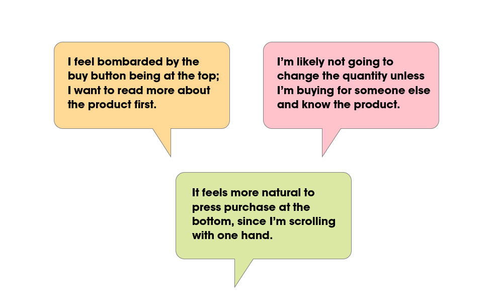
We tested the two prototypes; each had a different approach to the individual product page. The feedback made it clear that the buy-button should be at the bottom, and users preferred to scroll through the information rather than tap to open drawers. Quantity was also determined to not be that important, so I kept separated from the sticky buy button.
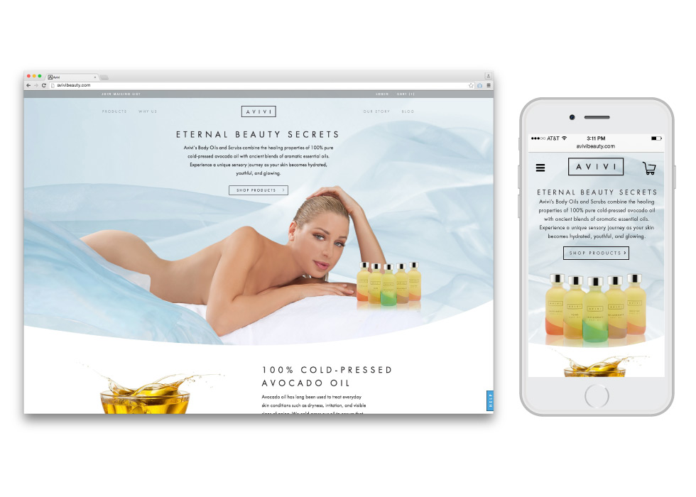
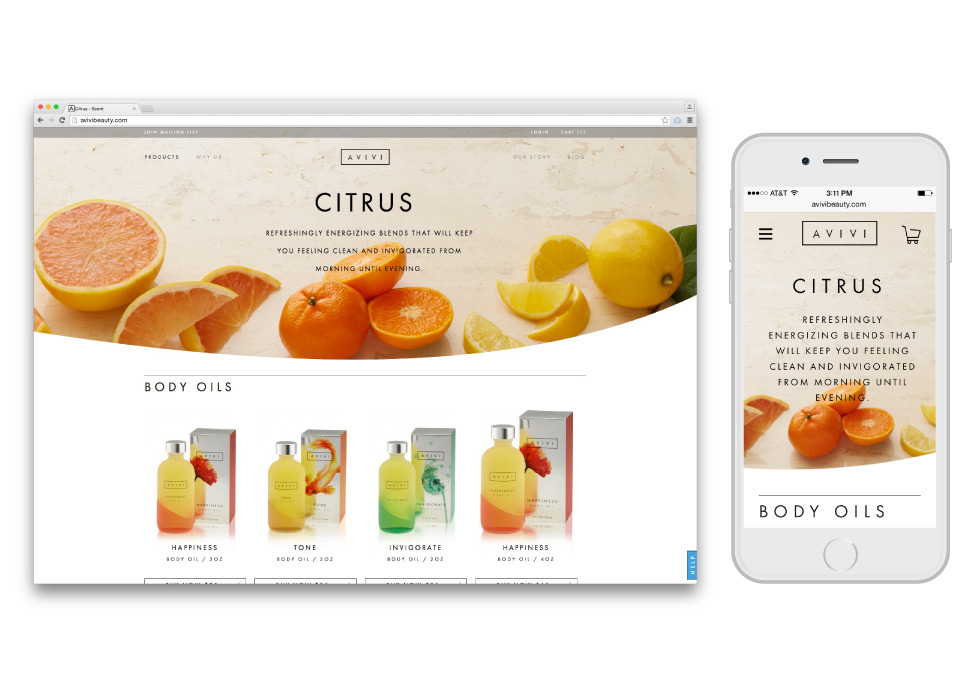
Final Brand Site Design
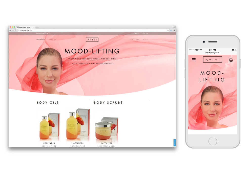
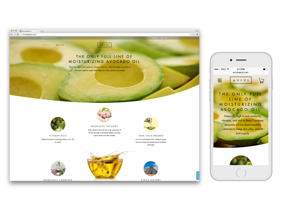
The final Avivi Site design features carefully art-directed model and ingredient photography to build an aura around the brand. Users can navigate by scent, product category or family, while learning about the benefits of cold-pressed avocado oil via authority building articles, reviews, and ingredient features. Individual product pages emphasize ingredients and benefits over hard-sell tactics.
Microsite Planning
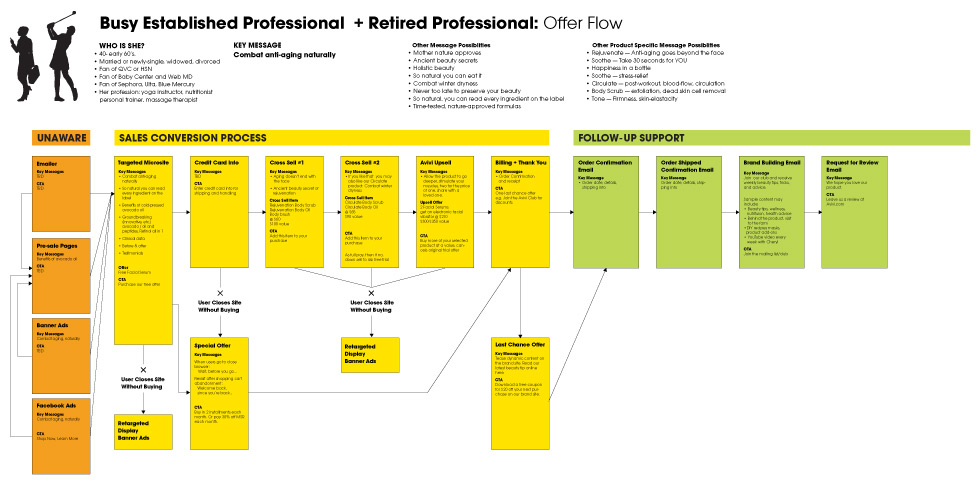
Since Avivi’s initial launch would be subscription based through their own site exclusively, we needed to map the entire customer journey from discovering the brand via targeted ads and emailers, through to a step by step offer and cross-sell system, ultimately leading to purchase and follow-up support.
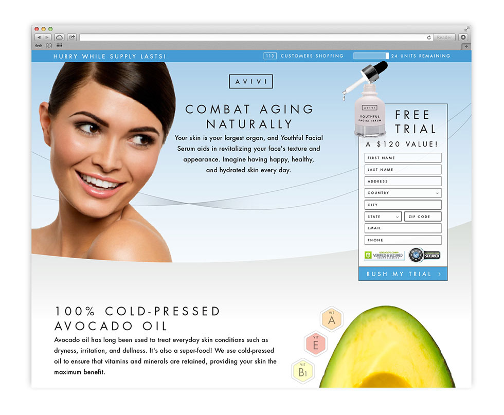
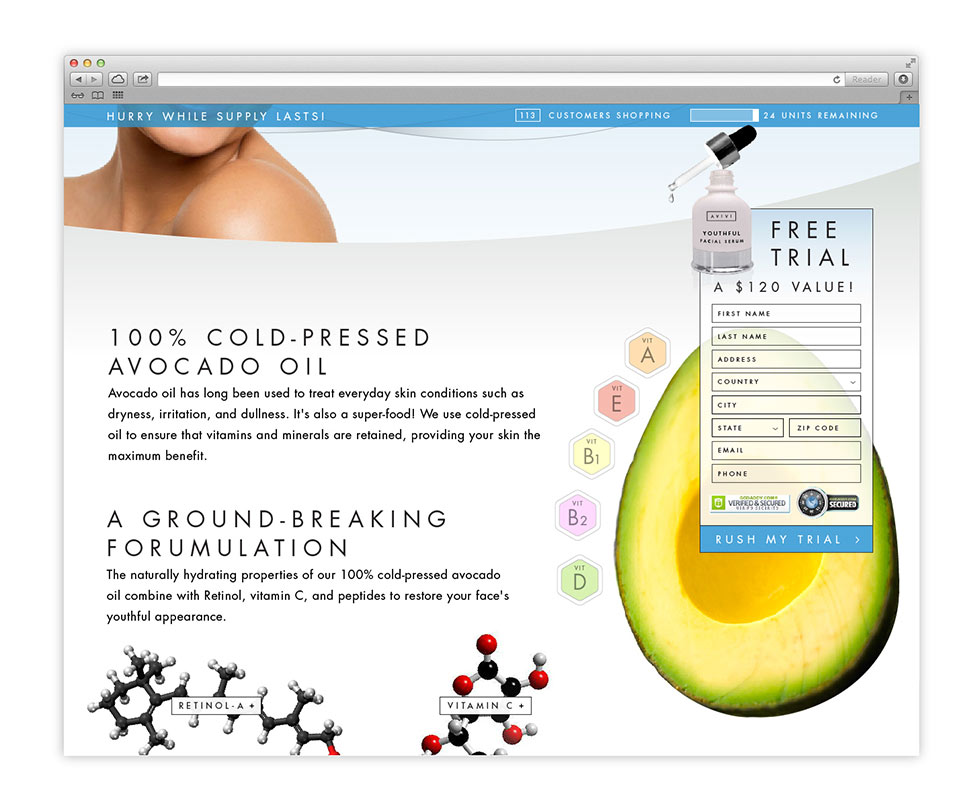
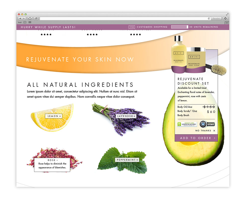
Microsite Design
The microsite uses the same visual design cues as the brand site—gentle curves lead the eye towards the action box, which initially contains a form. On subsequent pages, this becomes an add-to-order cross-sell. In addition the microsite employs other tactics including a scarcity module and real-time shopper number.
 VIEW ALL UX